The Last of Us – Accessibility Case Study
UX design/UI design
With the growing popularity of the TV adaptation of The Last of Us, I decided to take on a fun side project of creating a case study for the original video game. I took a look at how it holds up to accessibility standards in games today and took on the challenge of re-imagining a few screens to create a better experience for players. To test my instincts I ran an A/B test comparing my design with the original and iterated on those results. This was a super fun exercise in gaming UX/UI and I can’t wait to take on more work like this in the future.
Redesigned Crafting Menu

Analyze & Re-Imagine
I played ‘The Last of Us’ when it first came out, but like many gamers, I got distracted and never had a chance to come back to it. Coming back to the game after a few years, and taking a look at it through an accessibility lens really put it in a new perspective for me. I tried to put myself in the shoes of a player who may have low vision, or who is possibly hard of hearing. Armed with Xbox’s Accessibility Guidelines (XAG) and the ever-helpful site Can I Play That, I was ready to dive back in.
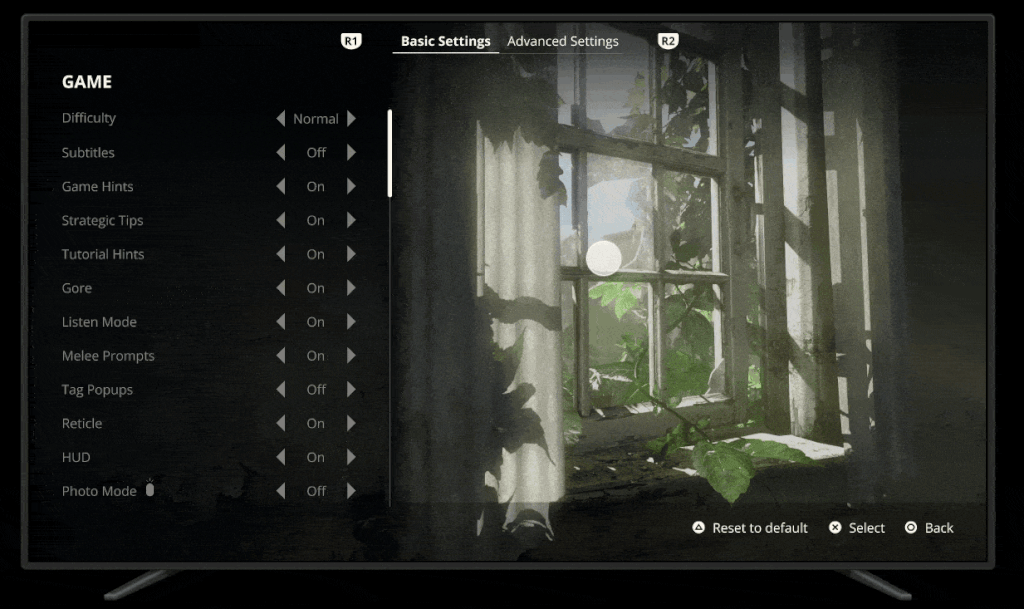
Original Game Settings
Re-Designed Game Settings
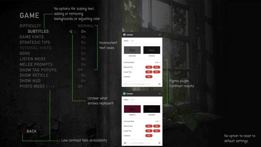
After booting up the game, these were the first few problem areas that needed improvement:
- No way to scale the text or change colors if I needed to.
- Areas of low contrast, making menu items difficult to read.
- No way to reset to default settings in case I wasn’t happy with my choices.
By not providing clear menu items, players might feel excluded before they even begin gameplay.
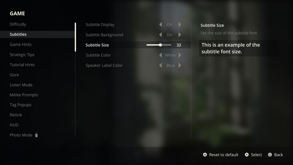
For my re-design, I took a controller-first approach and put thought into how a player might navigate this screen if it had more options to adjust as needed. I tackled subtitles first as this can make or break a game:
- Added more options for subtitles. By following XAG, the text here would sit at a minimum of 26 px at 1080p, but a player has the ability to scale it larger.
- Text is set to title case, as players with dyslexia have difficulties reading all caps or all lowercase letters.
- Ability to add a background to the text to increase the contrast in lighter environments.
- An option to change the color of the speaker label for those with low vision.
- An example in the next column so that players can make an informed choice.
- Controls for resetting, making a selection, and going back to the previous screen in the lower right corner.
Original Subtitle and Button Prompt
Re-Designed Subtitle and Button Prompt
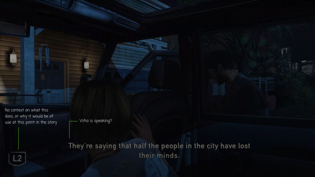
Moving on from settings, I was ready to get into the game and the story of these characters. There were a couple of areas that caught my attention:
- No speaker labels. I turned the volume to 0 on my TV, and when multiple characters were on screen, I had no idea who was saying the line presented to me. (These were added later in an updated version of the game, but only during the first line.)
- Prompted with the L2 button but with no indication of what it did and no other context. (Not keen on pressing random buttons after nearly getting eaten by a neighbor in the previous scene.)
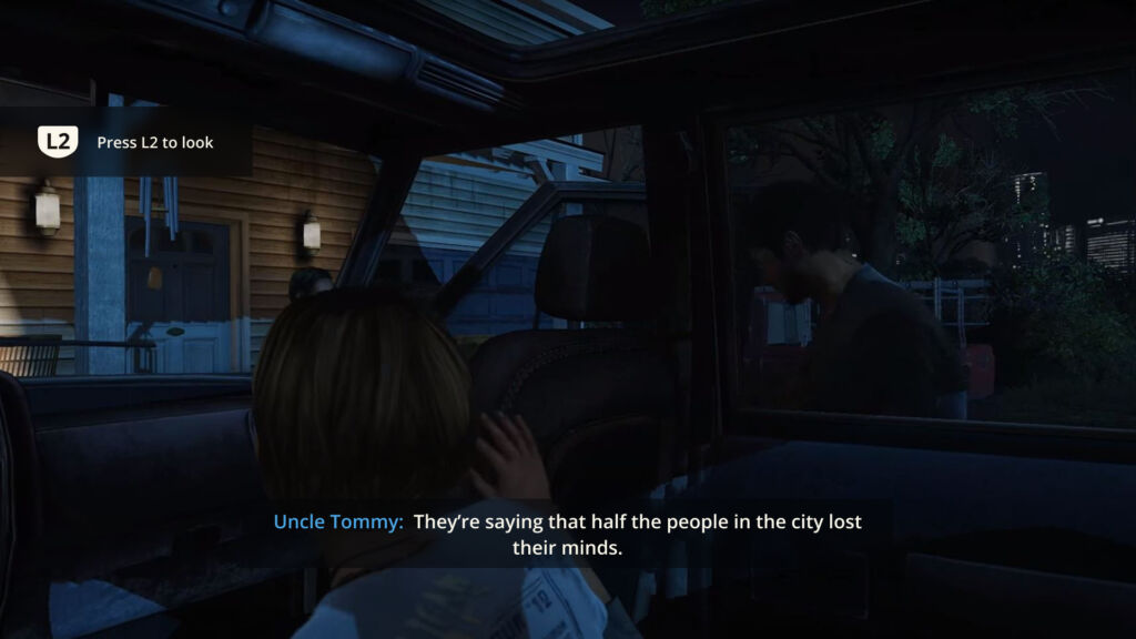
In my version of this screen, this is what I imagine the subtitles and button prompts would look like at default:
- A clear indication of who is speaking with a speaker label in a different color than the rest of the text.
- The button prompt is a simpler button design in a high-contrast white color and contextual text to let the player know exactly what would happen if they press that button.
- A low-opacity background to increase contrast in different environment settings.
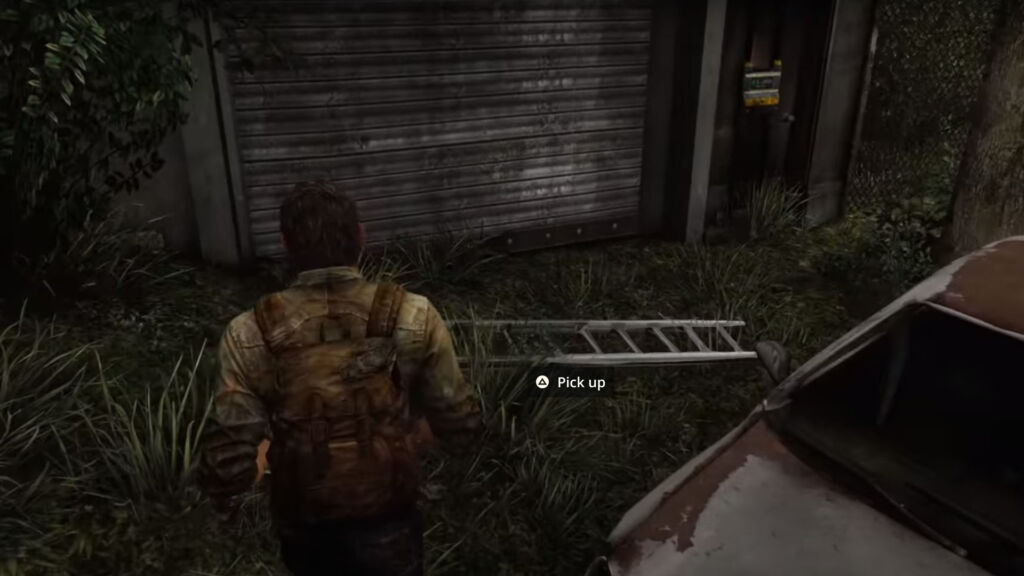
Original Item Interaction
Re-Designed Item Interaction
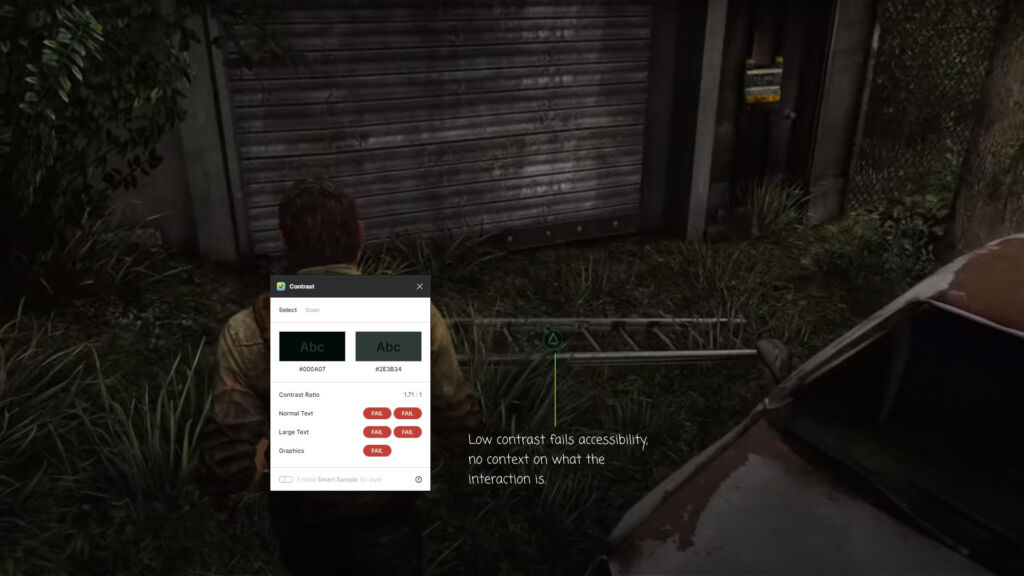
Now that the scene has been set, it was time to start exploring the world around me and interacting with different elements. Easier said than done:
- The focus indicator was difficult to see and had no context of what the interaction was.
- A green outlined button in green grass causes a lot of problems with contrast, especially for players with low vision.
According to XAG this could be disorienting for players and make it difficult to perform basic tasks, in this case, picking up an item.
My approach to this was to increase visibility without breaking immersion for the player:
- A slight sheen that would animate across the object as a player approaches.
- A button prompt with contextual help would appear as the player gets closer.
- The button itself a high-contrast white against a darker background, making it easily legible across multiple environment settings.
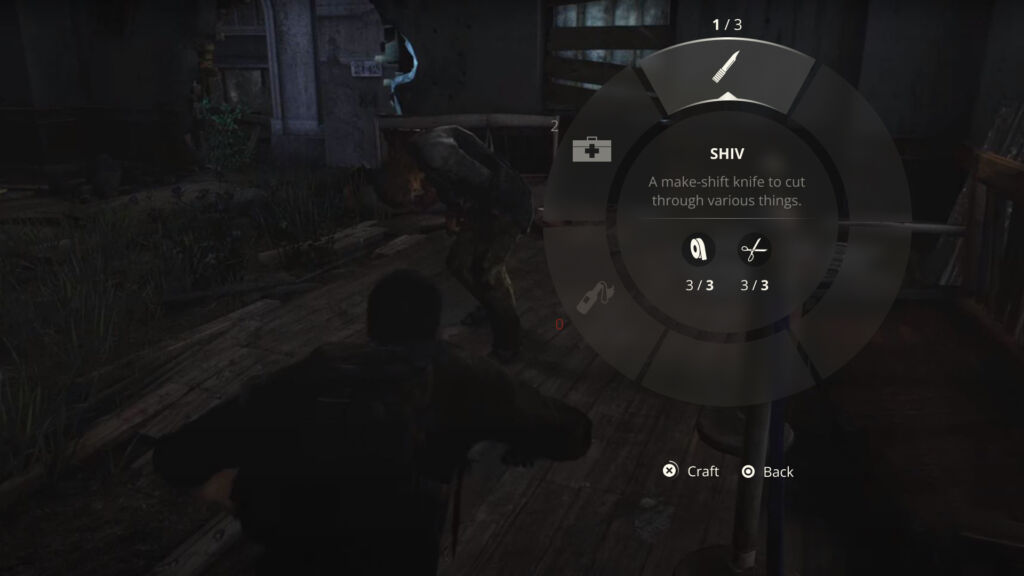
Original Crafting Menu
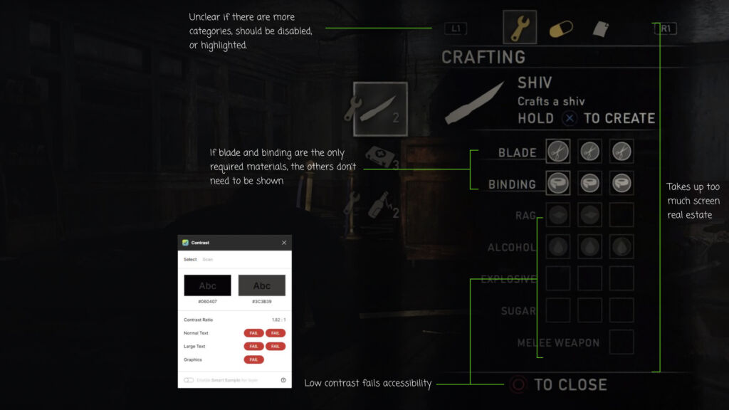
Re-Designed Crafting Menu
Upon reaching an area filled with afflicted characters, I found myself needing to quickly craft a weapon. The crafting menu was overwhelming for a few reasons:
- The crafting menu took up about a full third of the screen, obstructing the view of my surroundings. (Not a great idea when you have NPCs around that want to eat you.)
- I was shown materials for items unrelated to the weapon I wanted to craft, and the layout itself felt cramped.
- From an accessibility standpoint, the low contrast of the close button and disabled items made it difficult for legibility.
I took the crafting menu in a different direction, one that would lend itself well to the player’s surroundings:
- A radial-style crafting menu, which is often both controller and keyboard friendly.
- This menu style provides a wider view of the environment the player is in.
- Content is minimal, only showing the materials needed for a particular item, along with the remaining number in the inventory. This pattern allows the player to craft items on the fly in times of need without being overwhelmed with options.
- A more in-depth crafting UI would be available once the player arrives at a crafting table. In that instance, the original crafting menu could be of more use.
Usability Testing
To validate my design decisions I ran an A/B test using Google Forms and reached out to various social networks on LinkedIn, Twitter, and Discord. I was able to get some great feedback from students all the way up to gaming industry professionals.
GAME SETTINGS
When comparing the original game settings (A) and my re-design (B), it was an even split between minimal settings and more options.
SUBTITLES | PROMPTS
For subtitles and button prompts, my re-design had an 85% preference over the original for the clear speaker labels and improved button prompt.
ITEM INTERACTION
The redesign of item interaction was the clear winner with a 92% preference of a higher contrast icon button and contextual help on functionality.
CRAFTING MENU
When an item needs to be crafted quickly, 69% of participants preferred the redesign for the minimal layout and better visibility of the environment.
Overall Takeaways
Iterate
As I analyzed the results of the usability test I was surprised to see a 50/50 split on the settings menu. Giving it a bit more thought, I realized that it made sense. Here’s how I tackled the iteration:
- There will be players that will just want to jump right into the game and not spend a lot of time tweaking settings.
- Then there will be players where this need is essential to be able to enjoy the game like everyone else.
- To solve this, I combined the two. Basic settings for turning things on and off, and advanced settings for more customization. A next step would be to test the entire experience from end to end with players, then go from there.
Basic Settings
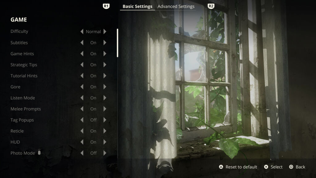
Advanced Settings

Prototype