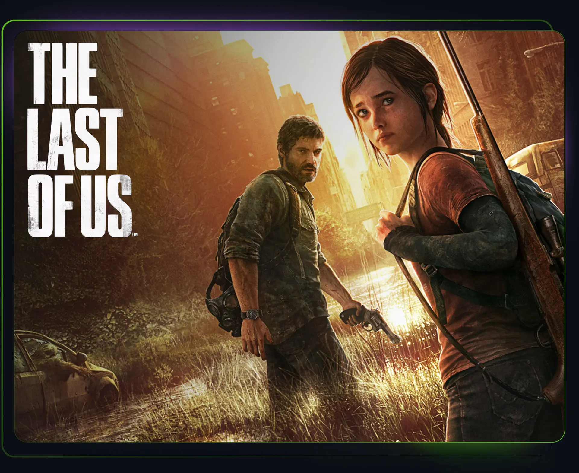
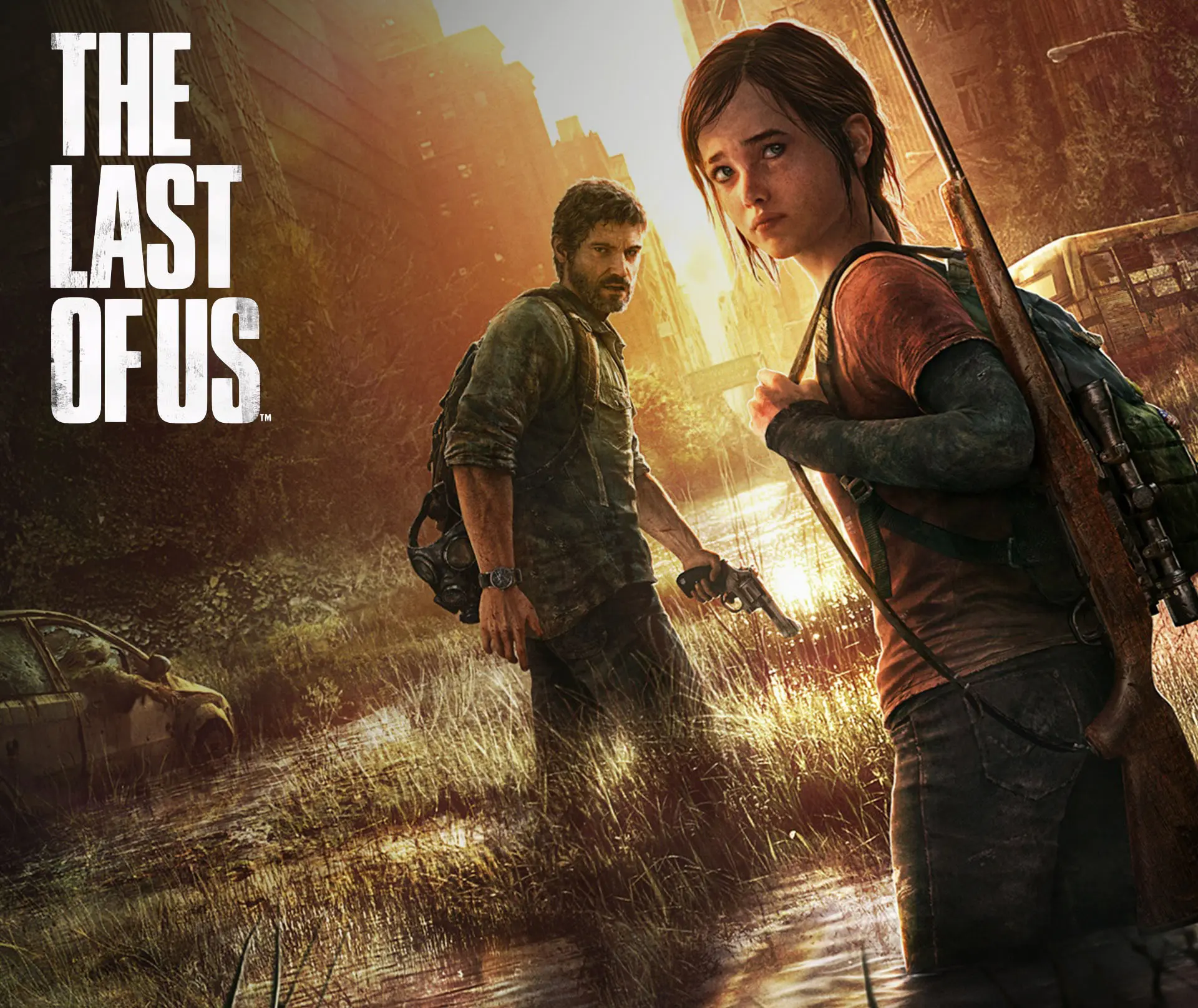
the last of us Redesign
The Last of Us is a narrative-driven action-adventure game set in a post-pandemic world where survival, resource management, and human relationships take center stage. Players follow Joel and Ellie on a dangerous journey across a fractured America shaped by infection, loss, and difficult choices.
ROLE
UI/UX Designer
TEAM
PLATFORM
PC/Console
YEAR
2023
OVERVIEW
With renewed attention on The Last of Us, I took the opportunity to revisit the original game through a UX and accessibility lens. This self-directed case study explored how a few thoughtful redesigns could improve clarity, usability, and player experience while still feeling true to the world and visual language of the game.
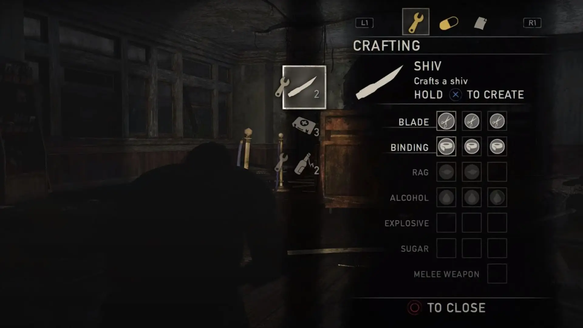
CRAFTING MENU
APPROACH
Rather than redesigning The Last of Us from the ground up, this project focused on identifying opportunities where accessibility and usability could be improved through thoughtful iteration. Using Xbox Accessibility Guidelines (XAG) and Can I Play That as a foundation, I explored ways to improve clarity, readability, and overall player experience while staying true to the original game.

Redesign
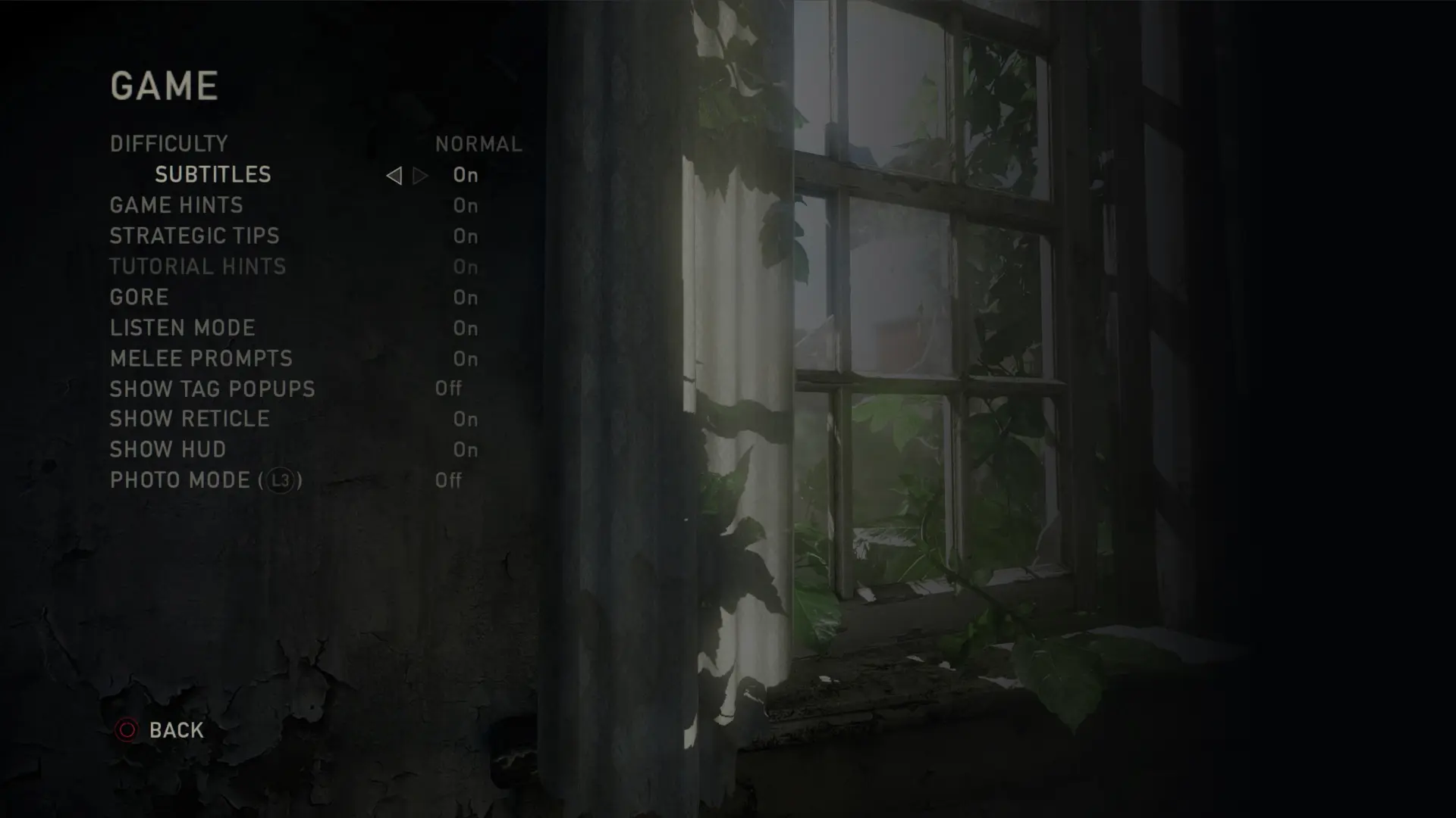
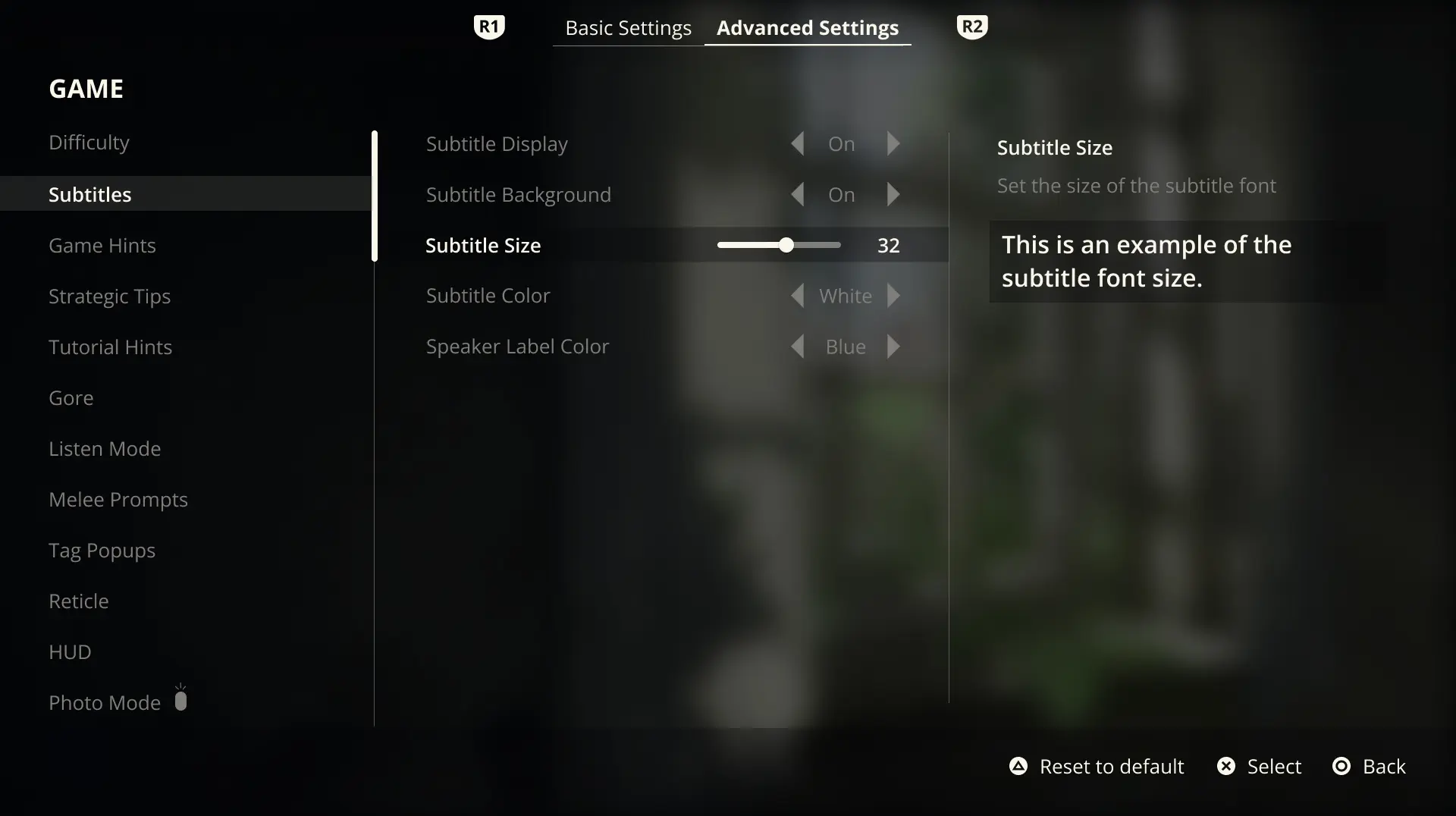
SETTINGS
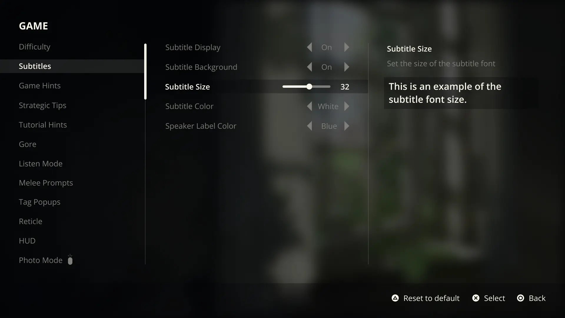
Accessibility begins before gameplay, which made the settings experience an important place to start. The original menu presented a few usability challenges, including limited text customization, areas of low contrast, and little flexibility for players to personalize or easily recover from unwanted settings changes.
The redesign took a controller-first approach and focused heavily on subtitle accessibility and navigation flow. Following XAG guidance, subtitle options were expanded to support scalable text, improved contrast through optional backgrounds, customizable speaker colors, and live previews to help players make informed choices. Clear controller actions and reset functionality were also introduced to create a more approachable and flexible experience from the very beginning.
MOVE THE SLIDER TO SEE A BEFORE AND AFTER COMPARISON
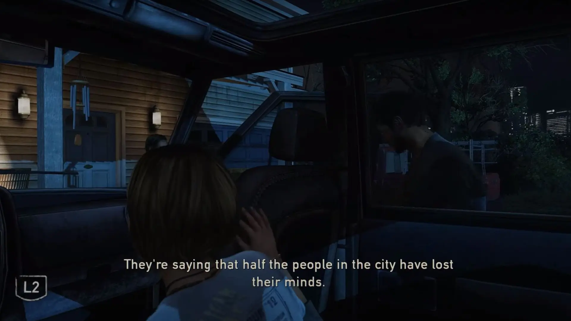
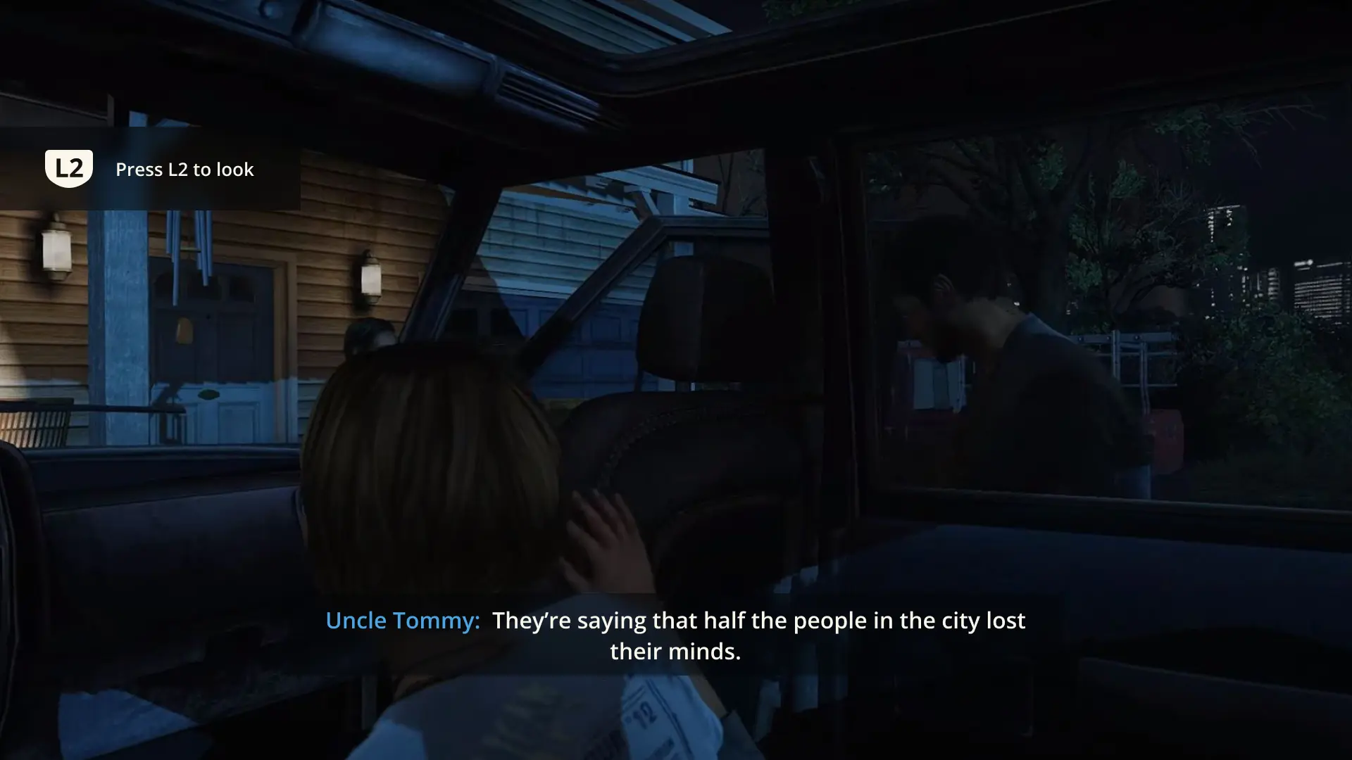
SUBTITLES AND BUTTON PROMPTS
Once I moved into gameplay, subtitles and button prompts were some of the first areas that caught my attention. Without speaker labels, dialogue became difficult to follow during scenes with multiple characters, and button prompts lacked enough context to clearly communicate what action would happen next.
The redesign focused on improving readability and clarity while staying true to the tone of the game. Speaker labels used stronger hierarchy and color distinction, subtitle backgrounds improved contrast across different environments, and button prompts were redesigned with clearer visual treatment and contextual text to better support player understanding.
MOVE THE SLIDER TO SEE A BEFORE AND AFTER COMPARISON
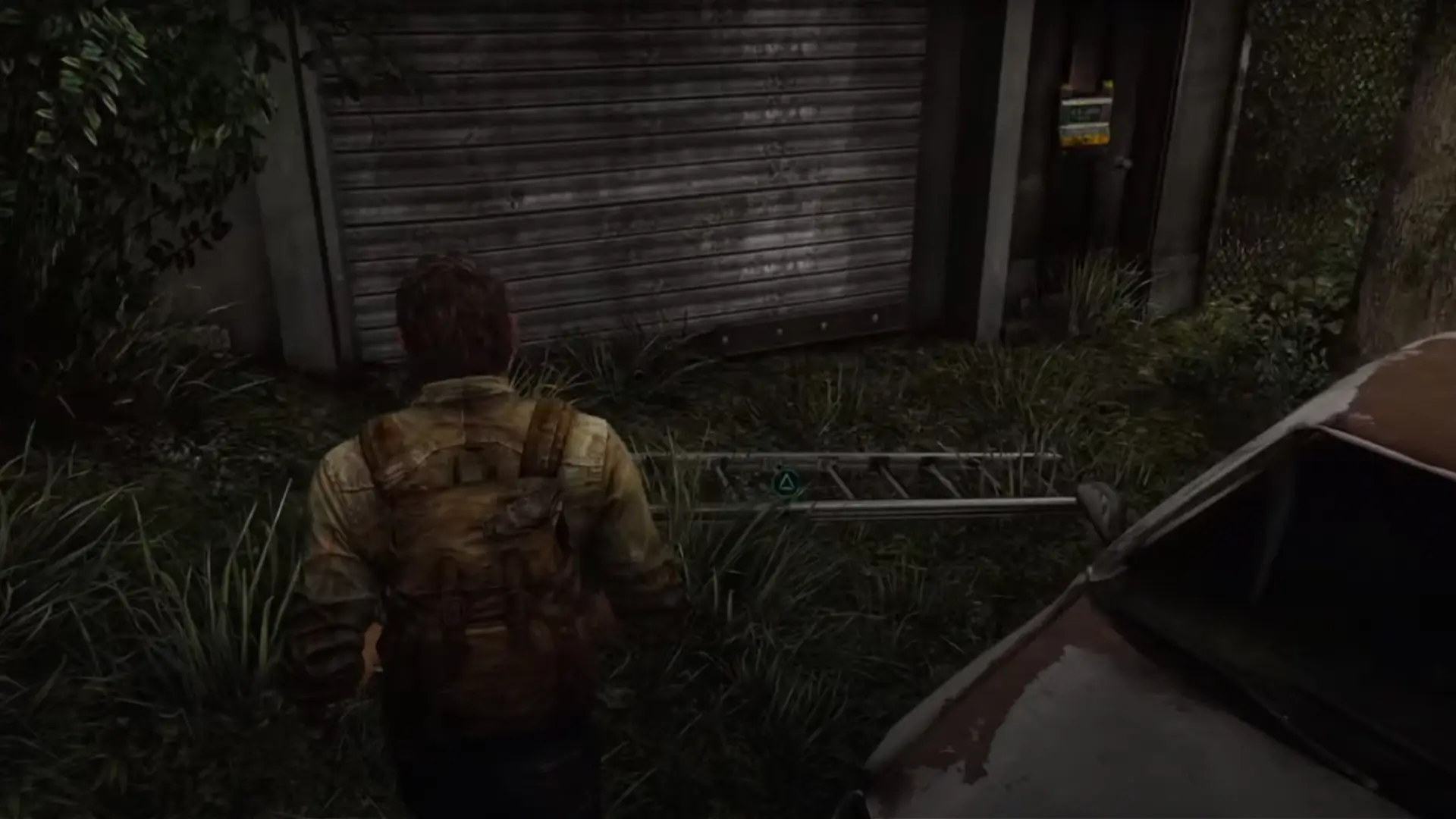
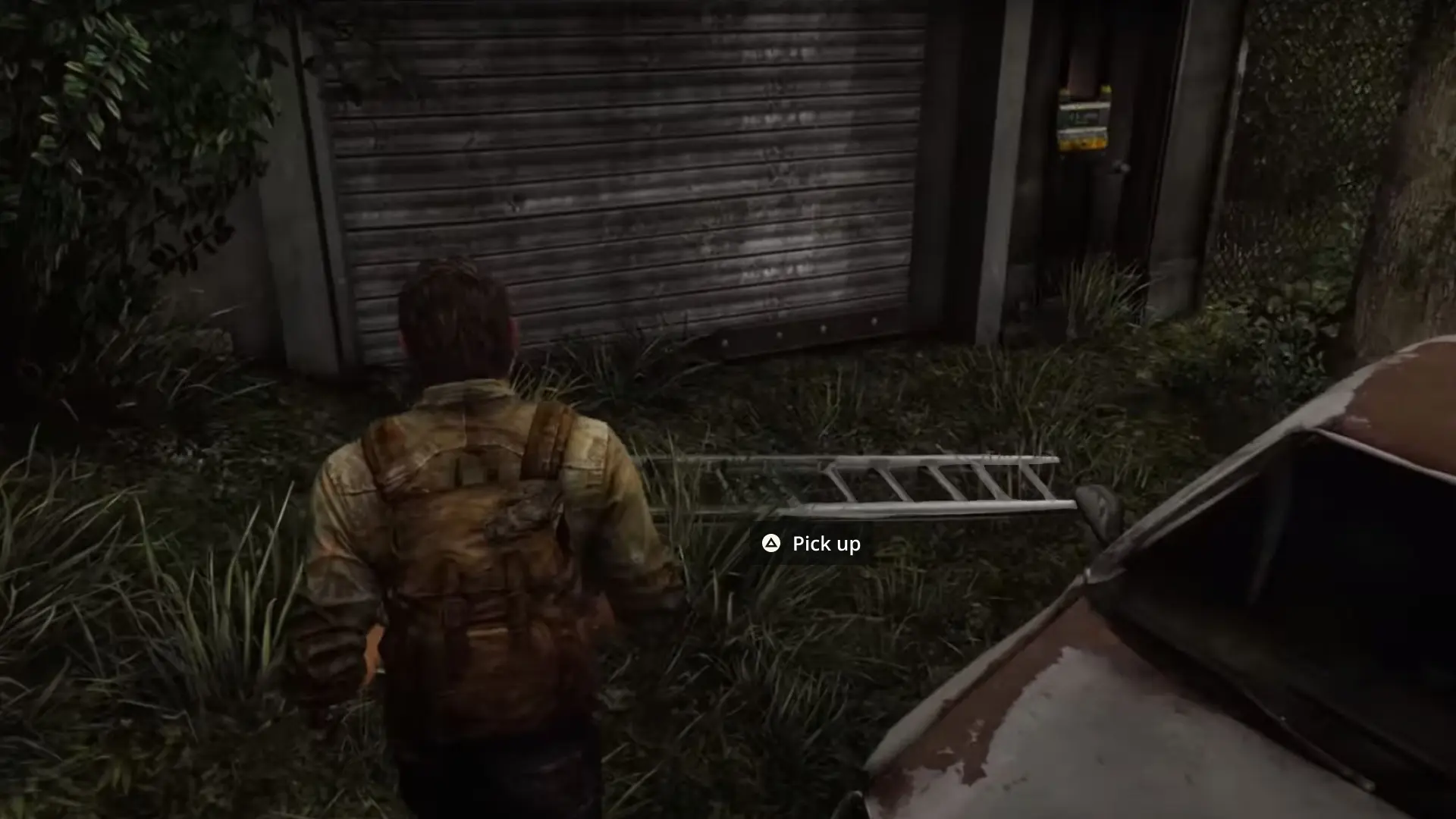
ITEM INTERACTION
As exploration opened up, item interaction revealed a usability challenges of it's own. Focus indicators were difficult to spot and offered little context around the action being performed, while low-contrast prompts could easily blend into surrounding environments. For players with low vision, this created unnecessary friction during otherwise simple interactions.
The redesign focused on improving visibility while preserving immersion. Interactive objects received a subtle animated sheen as players approached, helping draw attention without feeling intrusive. Contextual prompts appeared at closer range, paired with a high-contrast button treatment that remained readable across different environments. The goal was to make interaction feel clearer and more intuitive without pulling players out of the experience.
MOVE THE SLIDER TO SEE A BEFORE AND AFTER COMPARISON
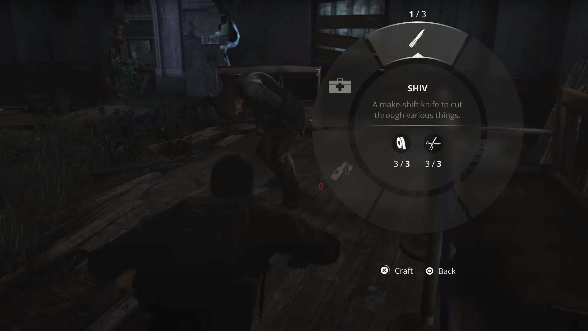
CRAFTING MENU
Crafting in The Last of Us often happens under pressure, making the original menu feel cumbersome in high-stress moments. The interface occupied a large portion of the screen, reduced environmental awareness, and surfaced materials unrelated to the item being crafted, creating unnecessary visual clutter.
The redesign explored a more situational radial menu that supported both controller and keyboard navigation while keeping players connected to their surroundings. By showing only relevant materials and inventory counts, the experience became faster, clearer, and better suited for crafting on the fly. More detailed inventory management remained reserved for dedicated crafting spaces.
MOVE THE SLIDER TO SEE A BEFORE AND AFTER COMPARISON
usability Testing
TEST RESULTS
To validate the redesigns, I conducted A/B testing through Google Forms and gathered feedback across LinkedIn, Twitter, and Discord communities. Responses from students, players, and industry professionals provided valuable insight that helped confirm successful changes and identify areas for further iteration.
26
PARTICIPANTS
1
A/B TEST
GAME SETTINGS
50%
Comparing the original settings menu (A) and the redesign (B) revealed an even split between players who preferred minimal menus and those who favored greater accessibility and customization options.
“I have multiple TVs, and also have pretty poor vision, so having more options along with a visual representation of them helps me make the right choice.” — Participant
“I like the more natural feel of A. It still feels like you’re immersed in the game whereas with B, the background’s blurred out and it takes you out of the gaming experience.” — Participant
SUBTITLES
85%
For subtitles and button prompts, the redesign received an 85% preference over the original, with players responding positively to the clearer speaker labels and improved contextual prompts.
“I prefer the speaker to be specified in subtitles ESPECIALLY when scenes are not voice acted or it can get confusing. Makes it more accessible.” — Participant
“I didn’t even notice the L2 on option A until I realized option B had it. I would have missed the prompt.” — Participant
INTERACTION
92%
The item interaction redesign was the clear favorite, earning a 92% preference over the original. Players responded positively to the higher-contrast interaction prompts and added contextual guidance.
“It took me a few seconds to even see that black icon on the dark background in image A. I like that B is easier to see & read, and also tells me WHAT is about to happen when I press triangle (ie: pick up vs look at vs use).” — Participant
“I didn’t see the prompt and had to zoom in to see it in option A so I would definitely miss it.” — Participant
CRAFT MENU
69%
When crafting under pressure, 69% of participants preferred the redesign, favoring its more minimal layout and improved visibility of the surrounding environment.
“B is less cluttered visually and is quick and clear about what your options are so I like it. Having a wheel instead of a full menu means you also spend less time pausing the gameplay.” — Participant
“Second one, I’m more used to the wheel style than the first one because of others games that require to cycle through weapons and craftables. Also this option takes less space from the screen and i can see my surroundings better.” — Participant
OVERALL
“These settings are something I wish more games would take into consideration. They can make or break how smooth gameplay is when dealing with various options.” — Participant
“Good UI is so important, I am glad you are taking the time to do this.” — Participant
Iteration
APPROACH
The 50/50 split on the settings menu was surprising at first, but after digging into the feedback it started to make sense. Some players want to get into the game quickly, while for others, accessibility and customization settings are essential to enjoying the experience comfortably.
The next iteration combined the two approaches, offering a simpler settings view alongside more advanced customization options. From here, the next step would be broader end-to-end testing to continue refining the experience.
BASIC SETTINGS
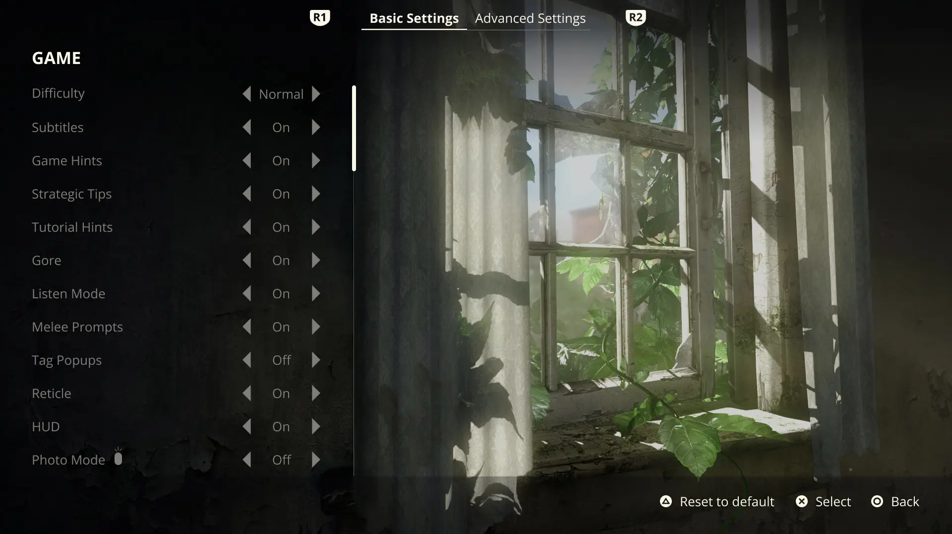
ADVANCED SETTINGS
PROTOTYPE
MORE PROJECTS
COPYRIGHT © 2026. ALL RIGHTS RESERVED