
Conflux: The Hereafter
Conflux: The Hereafter is an upcoming competitive MOBA that combines strategic gameplay, unique heroes, and immersive worldbuilding to create a fresh experience for both new and veteran players.
ROLE
Lead UI/UX Designer
TEAM
Convergence Studios
PLATFORM
PC/Console
YEAR
2023 - 2025

OVERVIEW
For Conflux: The Hereafter, I led the UI/UX design direction at Convergence Studios, helping shape the visual language and player experience for this in-development MOBA/Hero Shooter. The goal was to create a clean, intuitive interface that supported fast decision-making and felt welcoming to both new and veteran players.
CHARACTER SELECT
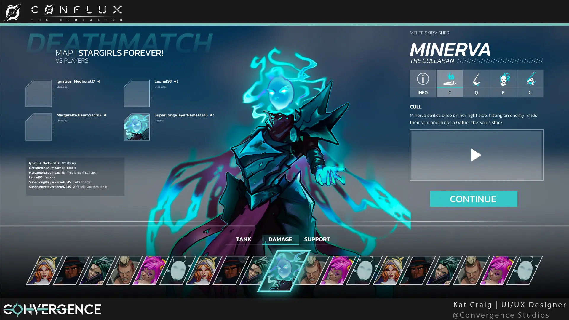
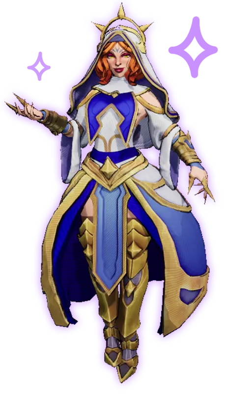
APPROACH
Conflux: The Hereafter explored the space between hero shooters and MOBAs, blending fast-paced action with deeper strategic gameplay. The approach centered on creating systems that felt approachable yet flexible, giving players the freedom to experiment with different playstyles and shape characters around their preferred strategies. Supporting this through both gameplay and character storytelling helped create a more personal and engaging player experience.
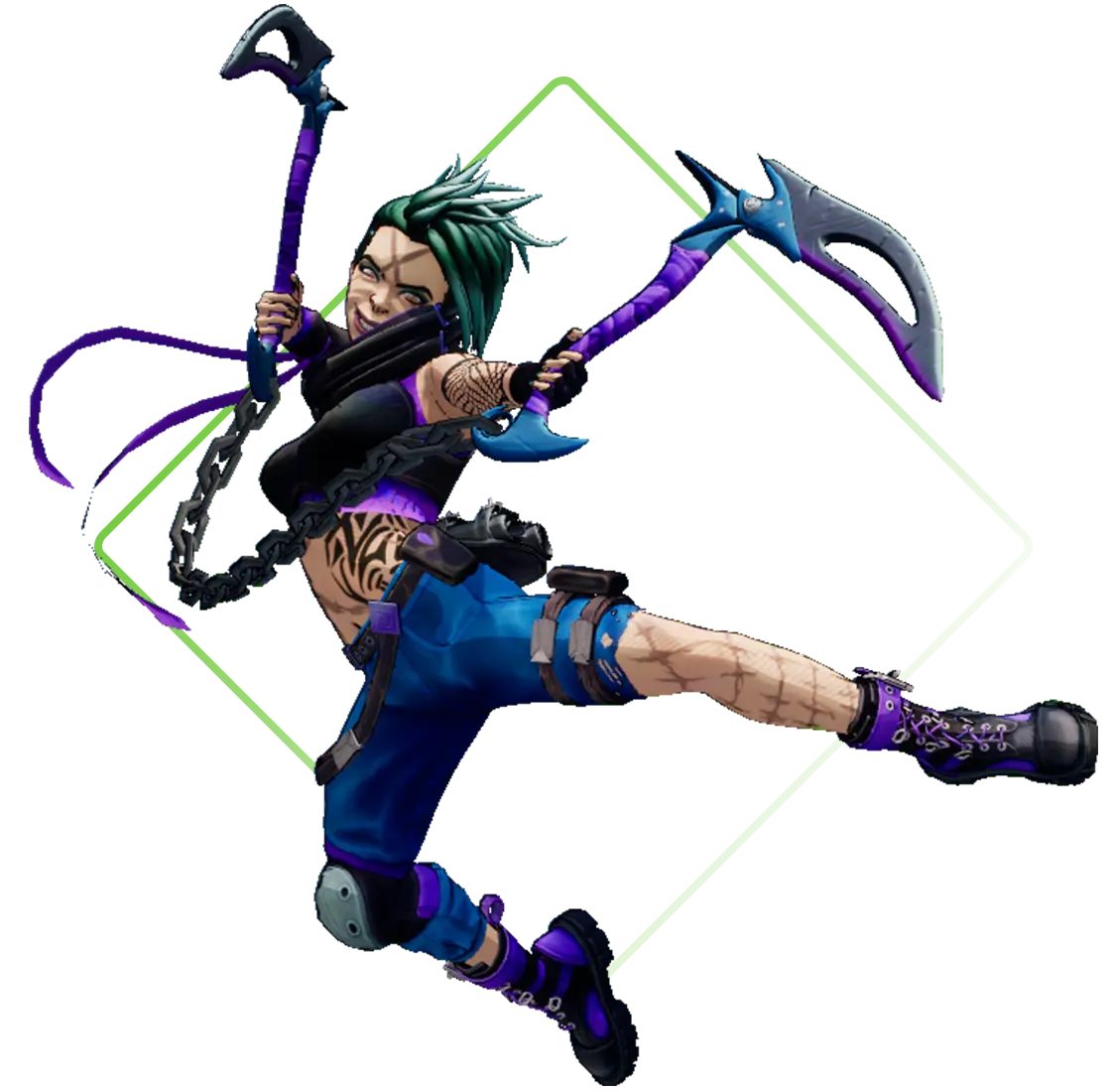
UX PROCESS
STEPS
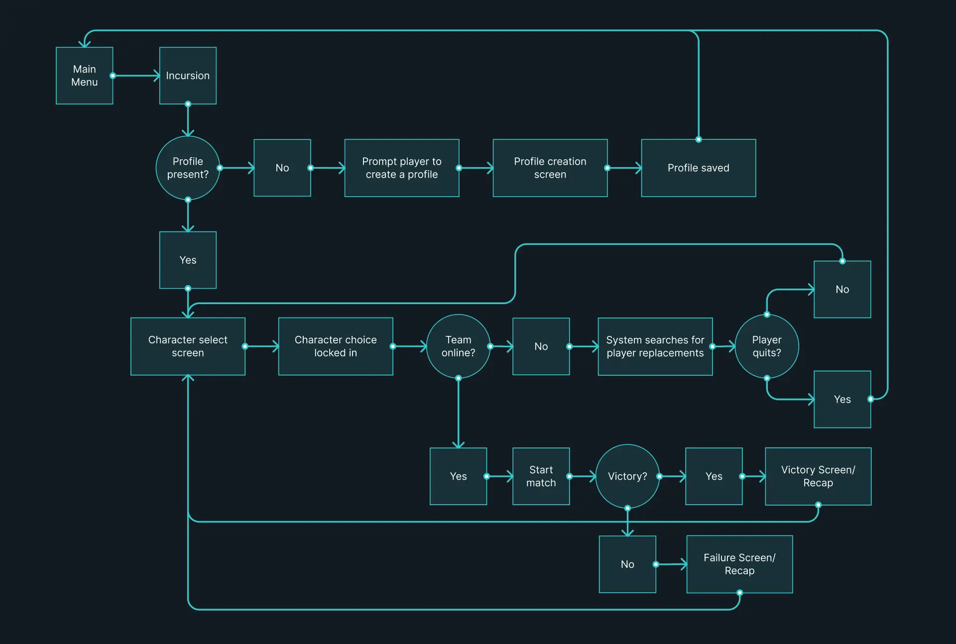
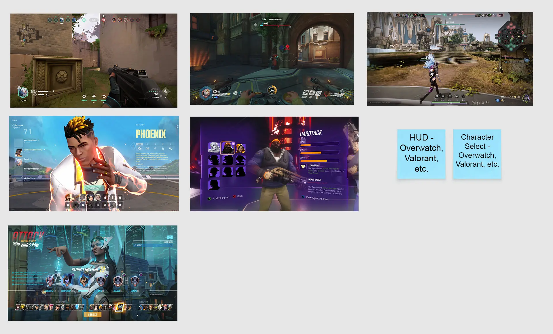
The UX process for Conflux: The Hereafter began with mapping player journeys to better understand key interactions, such as joining and preparing for a match. From there, I conducted competitive analysis across similar games to identify familiar patterns, uncover opportunities for innovation, and better understand player expectations within the genre.
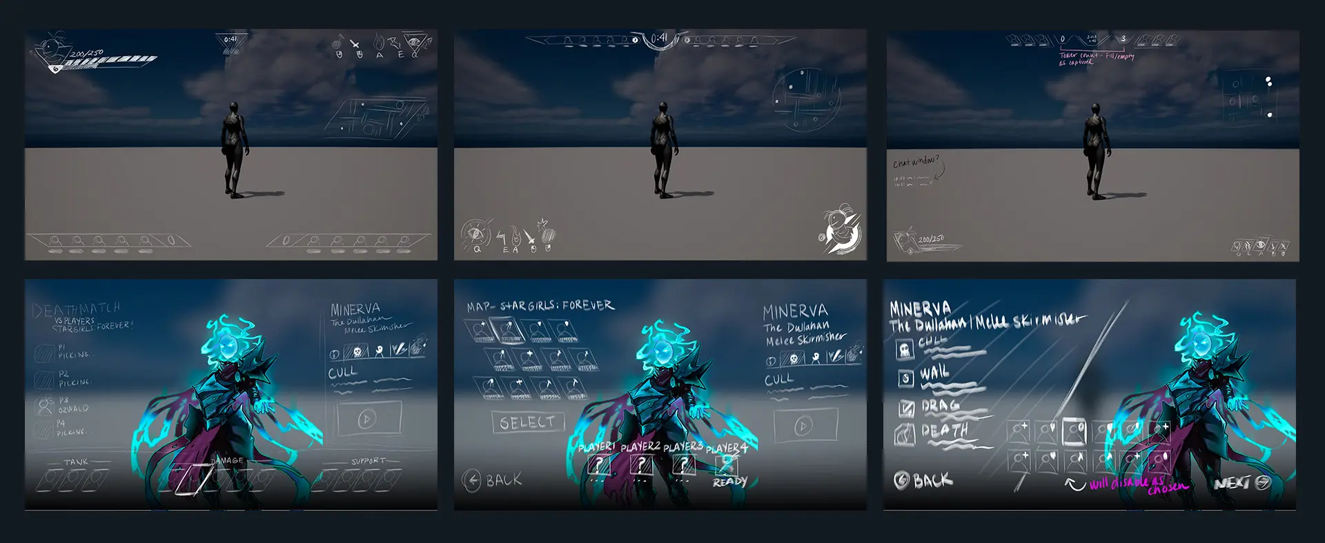
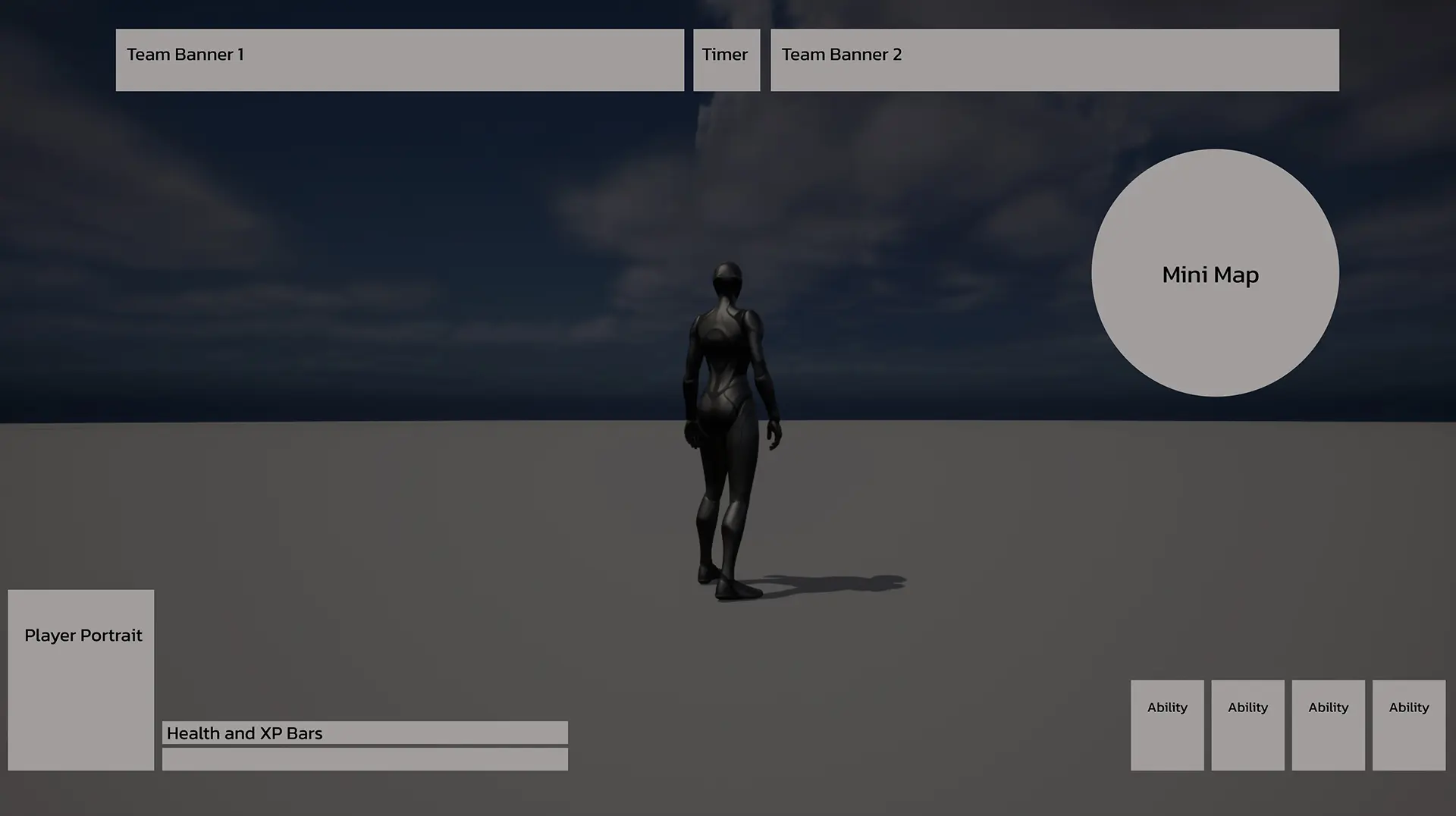
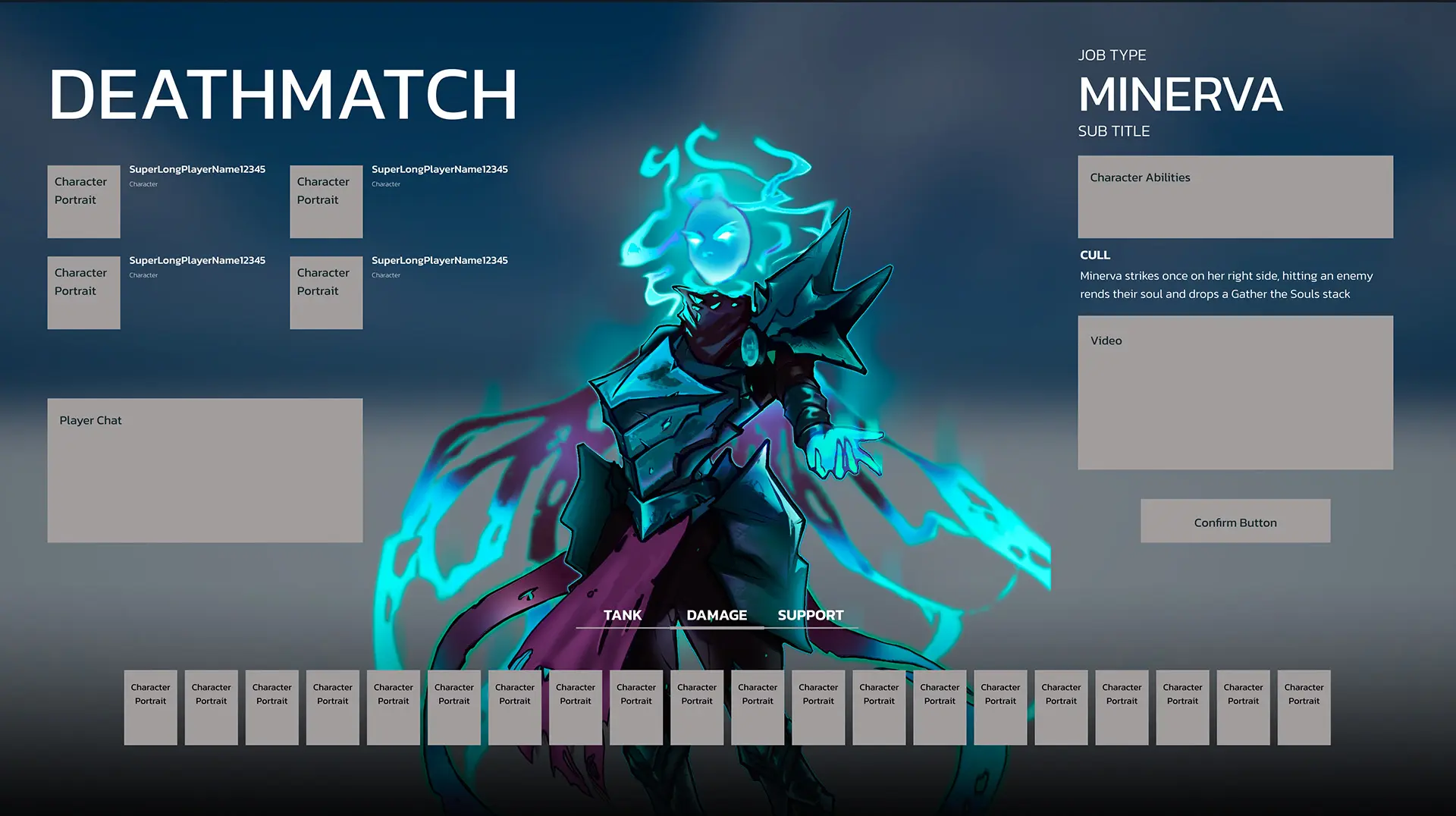
Using those insights, I explored iterative sketches for screens and character abilities before refining the direction through block frames and layout studies. This process helped establish a strong foundation for the UI, allowing the team to align early on both functionality and overall player experience.
PLAYER JOURNEY FOR MATCH MAKING
COMPETITIVE ANALYSIS
SKETCHES
BLOCK FRAMES FOR HUD AND CHARACTER SELECTION
LOOK AND FEEL
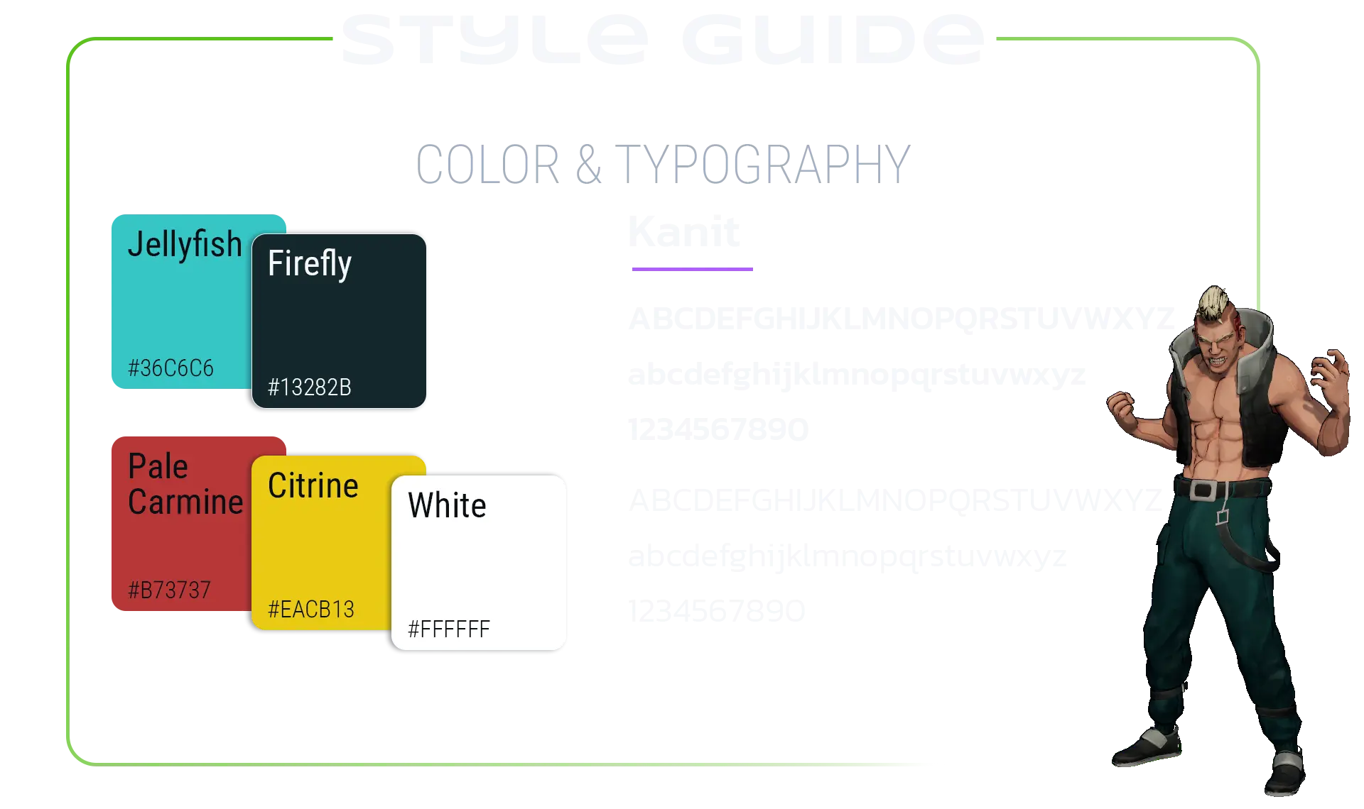
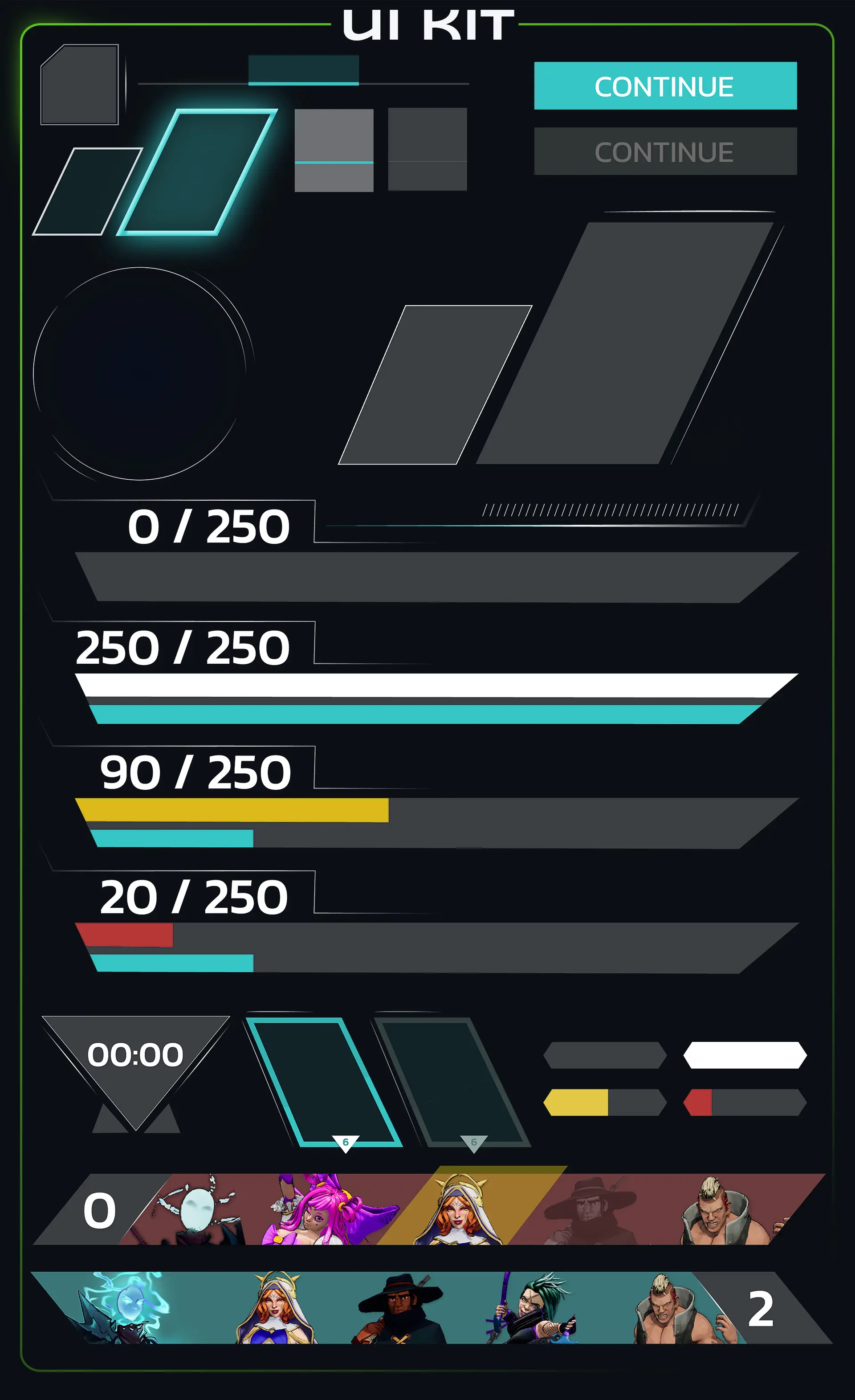
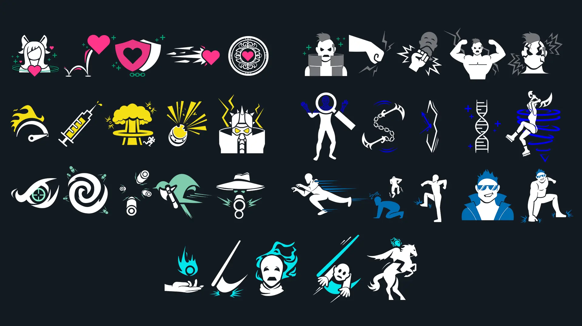
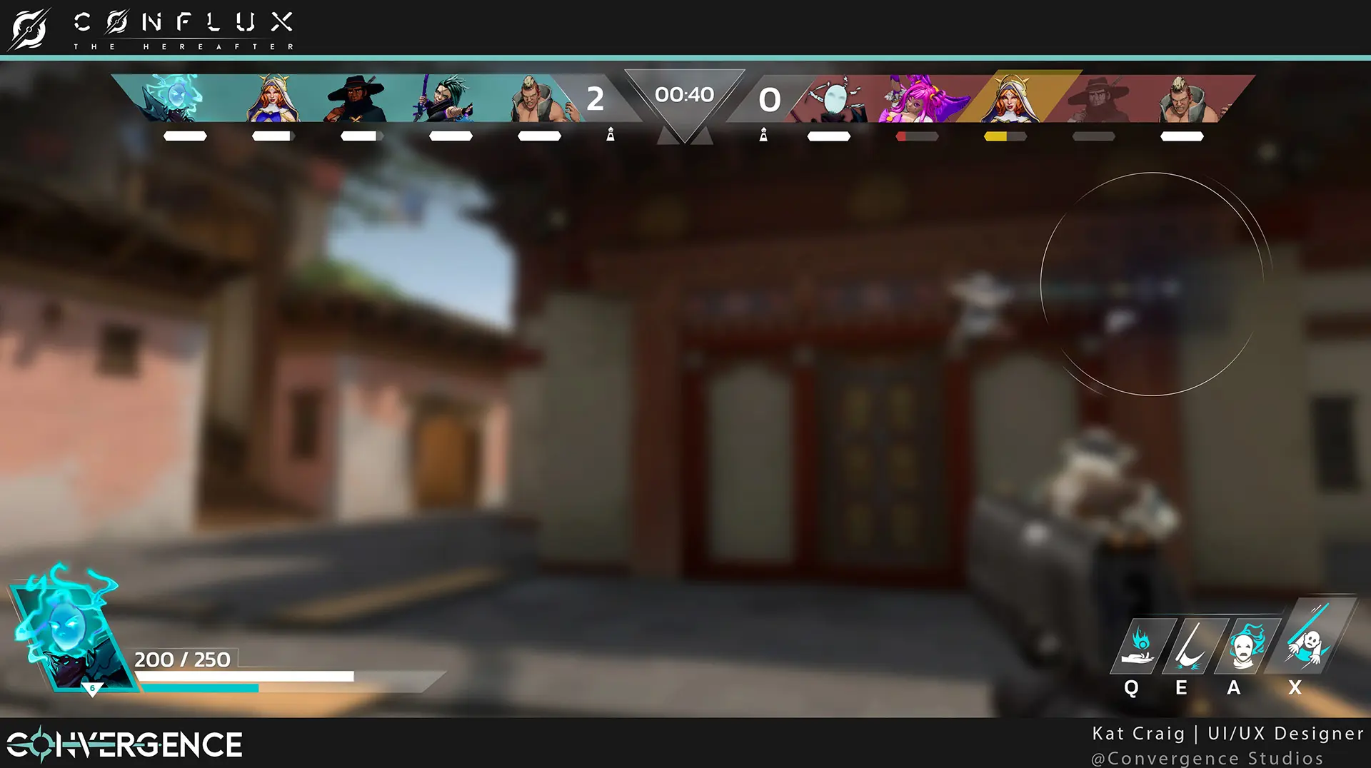
Conflux leans into a clean, modern UI inspired by the readability-first approach often found in competitive shooters. White and teal elements layered through varying opacity helped create an interface that felt lightweight and intuitive, present when needed but never competing with the action.
final screens
CHARACTER SELECT
HEADS UP DISPLAY
MORE PROJECTS

COPYRIGHT © 2026. ALL RIGHTS RESERVED